

-
Under the previous management there was a subscription option to remove ads. If you would like to use this option the subscription will be the same as previously, £12 for the year. I've set up a PayPal account solely for these payments bentleyspay@gmail.com Use the friends and family option and include your user name If you don't do PayPal, there is a bank transfer option. Send me a message for the account details. Again, I have opened a bank account solely for this. Thanks Andy (sgt_wilko)
You are using an out of date browser. It may not display this or other websites correctly.
You should upgrade or use an alternative browser.
You should upgrade or use an alternative browser.
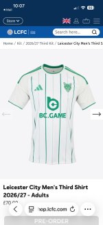
3rd kit
- Thread starter FoxinRutland
- Start date

2 Pints of Lager
Roofer
Don't like it, what's with the badge.

It's like they are so ashamed of our present station that none of our present shirts bears the proper Leicester City logo, either retro or made up like this.I do like it, except the badge

Lozfox1978
The eternal pessimist
Awful minty green garbage

ArmadaSur
Roofer
I really like After Eight mints.Awful minty green garbage

Whitwickfox
Roofer
It’s a no from me….awful.

FlemingtonFox
Roofer
Don’t like it. Why green? The club has no historical connection with that color. It’s just another example of how out of touch the owners/decision makers are.

Arlesey Foxile
I don't live in Arlesey now
I like it. Apart from the sponsor logo which looks like a 5-year old asked Chat GPT to make a logo with the letters BC
ArmadaSur
Roofer
They are doing the full range with or without the sponsors logo.I like it. Apart from the sponsor logo which looks like a 5-year old asked Chat GPT to make a logo with the letters BC

Club_B00k_Crutchless
Roofer
Anyone remember Pacers?

Prof
Happy Clapper or Moaning Ungrateful
It's a third kit, they bring out any other colour to get a sale. We've had pink and yellow and red and black. Truly we are simply blue and white.Don’t like it. Why green? The club has no historical connection with that color. It’s just another example of how out of touch the owners/decision makers are.
 I can sing a rainbow
Foxontherun
Non-Member
DH gate is all I will say on china £12.50 same exact shirtI appreciate it's purely a money making scheme having a 3rd kit, we've got blue for home and purple as a 2nd kit, if they constitute to a colour clash with another team they must have one strange shirt!

Foxontherun
Non-Member
DH gate is all I will say on china £12.50 same exact shirt
Collibosher
Roofer
Minging
Foxontherun
Non-Member
Minging

Prof
Happy Clapper or Moaning Ungrateful
While there are fools who will pay every season for the small variations in kit, the clubs will continue to tweak them and smile.It’s all bollox. Saw a pink kit today, looked like our from a few seasons ago. They just recycle the same kits so eventually every team will have played on all the same colours for their 2nd and 3rd kits.
At least some sports keep to the same kits.